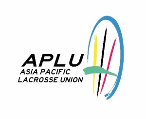
APLU Logo
Design & Development
In 2013, after several months of development, the APLU established its logo which met with wide acclaim from members at its launch in Beijing, China in the July, and which has now provided the APLU with an identity which is easily recognizable throughout the world.
Financial support to help develop this logo was provided by the Union’s inaugural members, the elements by Fiona Clark (APLU Executive Director) and the style and final product by Won Jae Park (APLU Director) and his professional team of designers.
Determining factors in the development of the design were:
- Colour
- Easily identifiable as the sport of lacrosse
- Incorporation of the full name of the Union
- Non-gender biased
- Size implications e.g., suitable for banner to lapel badge
- An Asia Pacific ‘connection’ theme
The APLU logo represents the union of the Asia Pacific regions of the world involved in lacrosse.
Every national flag in this region includes at least one of the four colours depicted in the head of the lacrosse stick, which are blue, yellow, black, and red on a white background with blue or black text.
The element which literally connects Asia and the Pacific is water and the greenish-blue colour ‘wave’ in the lacrosse stick is symbolic of the oceans/seas which have to be crossed for the meeting of players in a regional lacrosse event.
The stick is stylized so it does not specifically resemble either the men’s or women’s stick head.
The APLU aims to widen the exposure of the sport, particularly in new countries, through the use of the logo.
